AtlaSphere jr.
Pratt Institute, 2020
Brand Identity
Logo
Naming
Product Design
Objective
This project's goal was to choose an already existing product/tool and reimagine it for how it could help people in the future. After creating the product (hypothetically), the next step was to design a brand identity for the product.
Role
I worked on this assignment independently with feedback from my instructor and classmates.
Outcome
The initially imagined tool was a touchscreen globe. Rather than a traditional globe, the user would be able to zoom in and out, thus “traveling" through the globe. The interface of Google Earth inspired this project's outcome, but I wanted to reimagine it for physical touch. The next step was to define the target audience. Although the globe would surely be a useful tool for all, I concluded that it would be most beneficial for childhood education, thus adding the “jr" to the name.
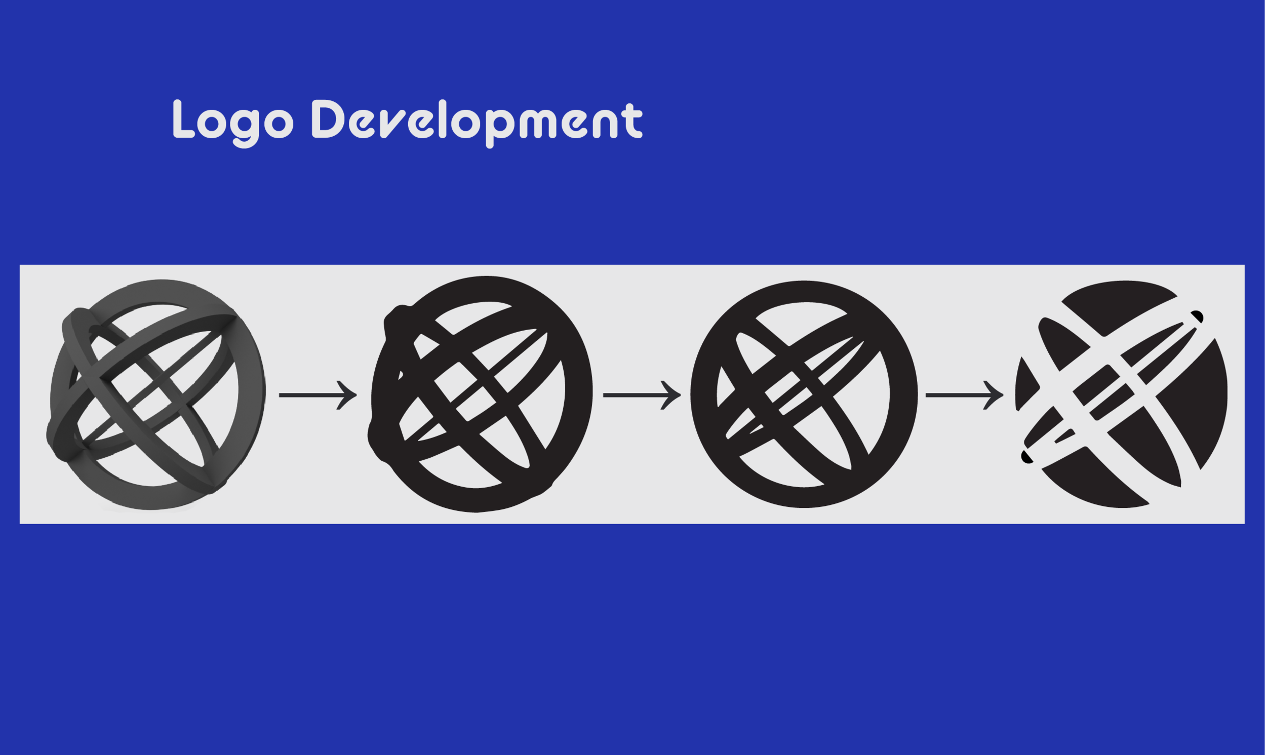
The name choice combines the worlds “Atlas" and “Sphere" to create AtlaSphere. The logo is inspired by the ancient astronomical device, the astrolabe. An astrolabe is a tool that helped people to observe and calculate the measurements of the universe. The typeface employs a loosely SciFi-based vibe while keeping the playful, childlike personality. The colors were derived from the colors of Earth and outer space.
map sources: Round World Products & NASA / JPL-Caltech


